Extrafemi studio · Concept project
Redesigning Trust: A Multilingual Landing Page for NovaBank, Lefkosa
NovaBank, Lefkosa did not ask for a new website. We designed one anyway, to show how a legacy bank site can build trust in two languages.
- Client
- None: an unsolicited concept, not commissioned
- Studio
- Extrafemi
- Year
- 2022
- Scope
- UX and UI, fintech, multilingual (Turkish and English) web design
- Tools
- Figma
01 · The brief
A concept nobody commissioned
This project was not commissioned. NovaBank, Lefkosa did not ask us for it. We did it anyway, as a concept.
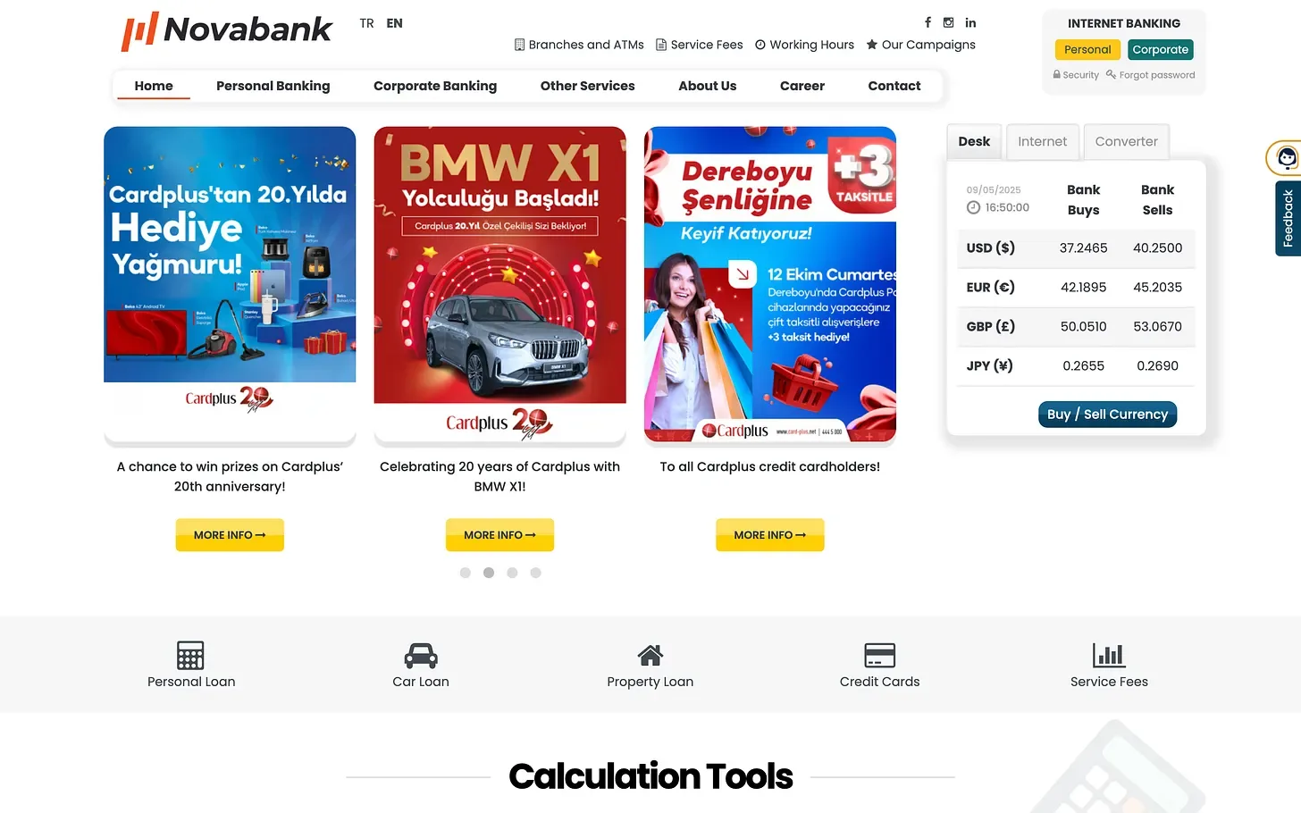
NovaBank, Lefkosa’s existing website serves its purpose, but like many legacy financial websites it leans on outdated aesthetics, cluttered layouts and limited UX flexibility. It reflects a time when banks simply needed to be online, not engaging.
View the redesigned concept here: the Behance project (opens in a new tab).
02 · The problem
The problem with the current site
Visit NovaBank’s current site (opens in a new tab) and you will find:
- A dated visual style with minimal whitespace.
- Dense text blocks that compete for user attention.
- Generic image banners with unclear calls to action.
- Navigation that feels more administrative than user-centred.
- An overall lack of mobile-first responsiveness.
- A language switcher that feels hidden and poorly integrated.
While it contains all the “right” elements (information, links and disclosures), the experience is transactional at best and confusing at worst.
03 · Goals
Redesign goals
With our redesign, the goal was not just visual polish. It was to create clarity, build trust and guide users to action. Specifically:
- Simplify navigation to match banking user behaviour.
- Reorganise services into intuitive, visual groupings.
- Introduce modern aesthetics that still maintain corporate integrity.
- Seamlessly support Turkish and English users.
- Prioritise accessibility and mobile UX.
- Increase conversions for loans, accounts and support.
04 · UX
Strategic UX highlights
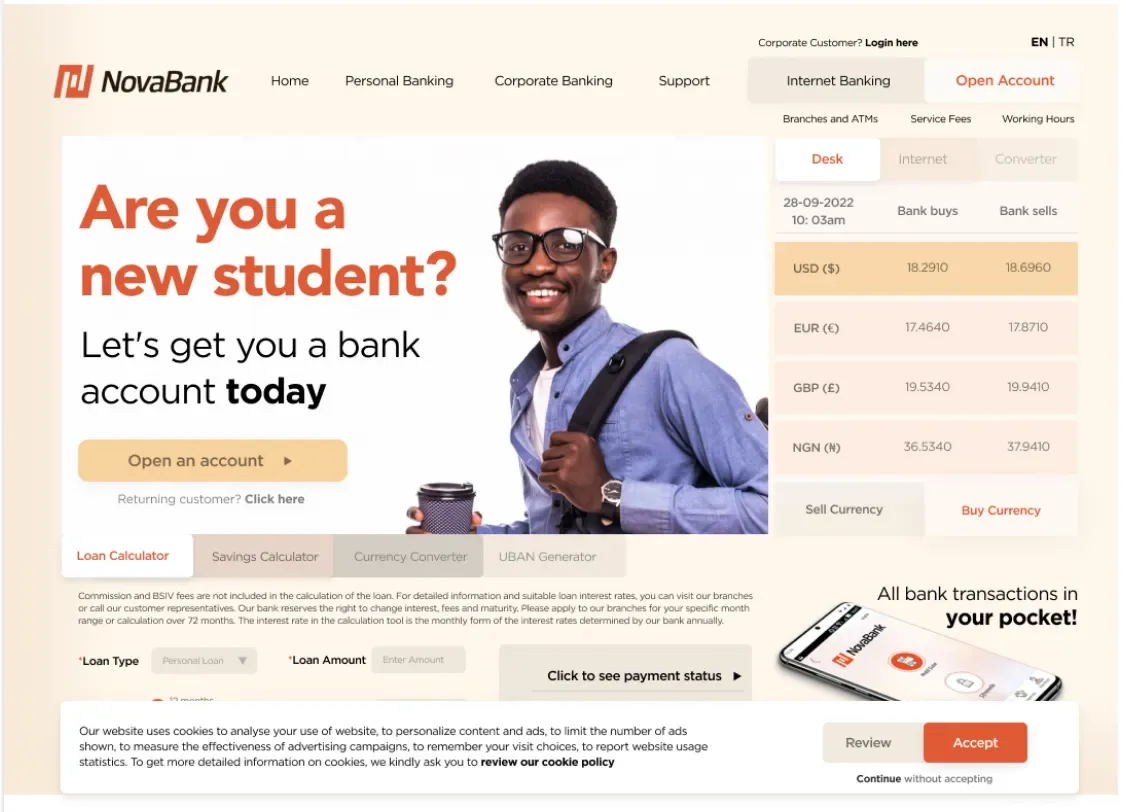
- Clear hierarchy. A reimagined hero section with focused headlines and a single call to action.
- Card-based layout. Services are broken into cards, each with icons and short, scannable text.
- Sticky language switcher. Always visible, letting users toggle between Turkish and English without friction.
- Mobile optimisation. Touch-friendly design, collapsible sections and scroll-based navigation make the site fluid on all devices.
- Modern trust signals. Subtle animations, client testimonials and certification badges that do not overwhelm.
05 · Design
Design decisions
- Typography. We chose high-legibility fonts for both Latin and Turkish characters.
- Colour palette. We shifted from harsh contrasts to cool navy tones with energetic accents for buttons and calls to action.
- Whitespace. Used intentionally to create breathing room and reduce cognitive load.
- Icons and visual cues. They help guide users through complex banking terms with imagery, not paragraphs.
All designs were executed in Figma, considering responsiveness and developer handoff.
06 · Before and after
Before and after: what changed
07 · Why it matters
Why it matters
NovaBank is a player in a competitive market, and digital users now expect the same level of convenience and clarity from their banks as they get from e-commerce platforms.
A landing page is not just a welcome mat any more. It is the handshake. It is the unspoken trust builder. Our redesign aimed to honour that role.
08 · Final thoughts
Final thoughts
Banks like NovaBank do not need flashy websites. They need functional, beautiful, multilingual tools that inspire trust and make navigation seamless. This project proves that even traditional sectors like banking can transform their UX with a few strategic, user-led changes.
See the redesign here: the full Behance case study (opens in a new tab).
Work with us
Have a project in mind?
Tell us about the work. We read every message and reply directly.
Start a project