Extrafemi studio · Case study
EBO: A Brand System for a US Talent-Booking Startup
EBO is a US media-tech startup that books and vets expert talent. We wrote its brand guidelines, for EBO and for its product, Vettify.
- Client
- EBO, United States
- Studio
- Extrafemi
- Year
- 2023
- Scope
- Brand guidelines for EBO and Vettify
- Tools
- Figma, Affinity Designer, Affinity Publisher
- Guidelines
- Behance (opens in a new tab)
01 · The client
Two brands, one family
EBO is a media-tech startup in the United States. Its site, joinebo.com, describes an all-in-one talent booking platform, and its product Vettify, at vettify.ai, helps people vet talent in minutes. That makes two brands that have to look related without looking the same. We wrote the guidelines for both, using Figma, Affinity Designer and Affinity Publisher. The full board is on Behance (opens in a new tab).
02 · The mark
A name drawn as one line
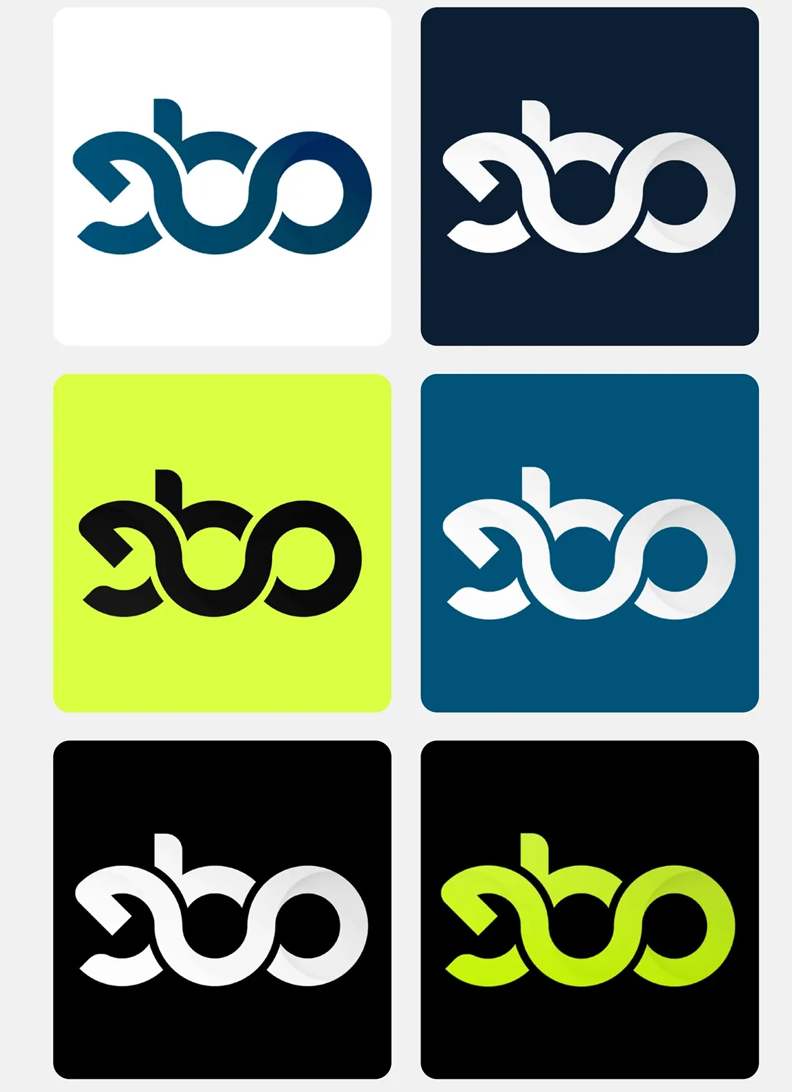
The EBO mark is the three letters drawn as a single looping line, so the e, the b and the o run into one another like a ribbon. It works because it is a shape before it is a word. The guidelines show it in six colourways: blue on white, white on navy, black on lime, white on blue, white on black and lime on black, so there is always a version for whatever it sits on.
03 · Vettify
Vettify, by EBO
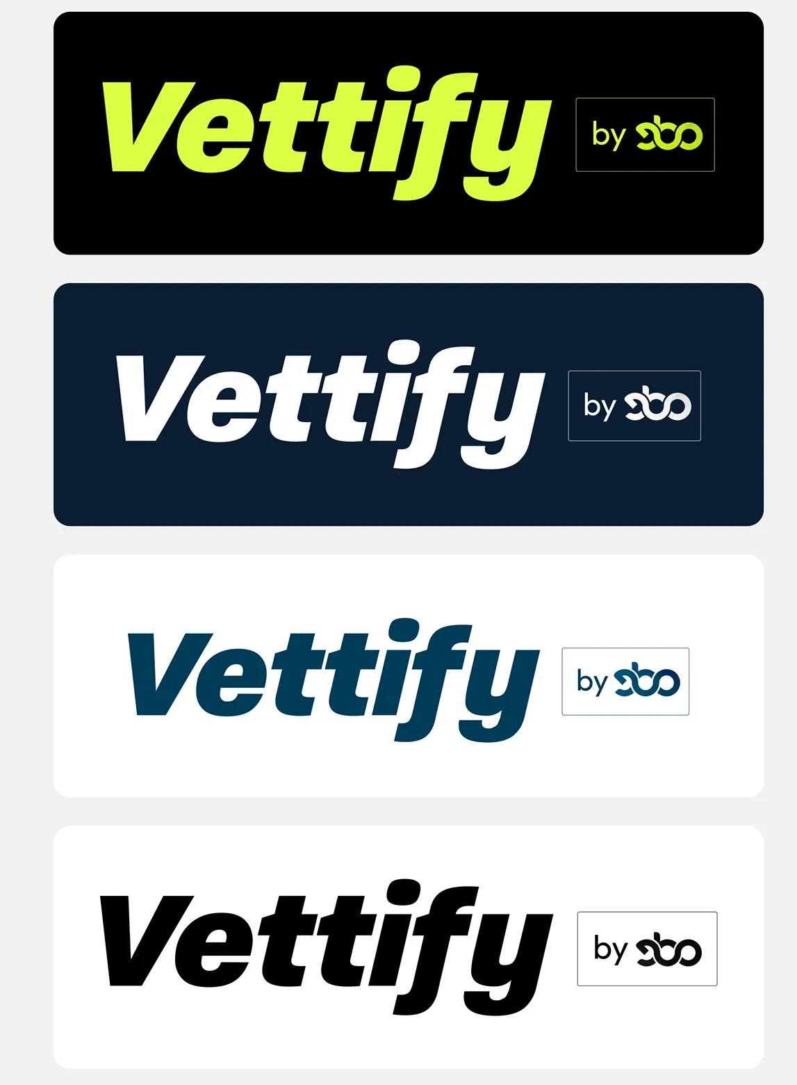
Vettify has its own voice: a heavy italic wordmark with a bold V as its app-icon-sized mark, in lime on black or white on navy. A small “by EBO” tag, with the EBO mark inside a thin box, ties it back to the parent every time. It is the guidelines’ clearest lesson: a product can be loud while the company behind it stays steady.
04 · Type and colour
Type and colour
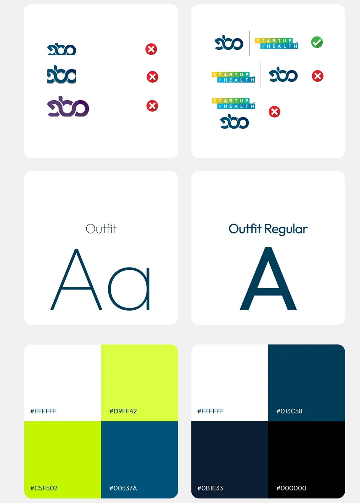
The type is Outfit, in light, regular and semibold weights, with Paralucent for text and Pacifico as an occasional script accent. The colour is a lime, an electric green-yellow used sparingly, against a ladder of blues and near-black: a mid blue, a deep blue and a navy. The board also shows what not to do to the logo: stacking it, recolouring it, or crowding it beside another mark.
05 · In use
The system at work
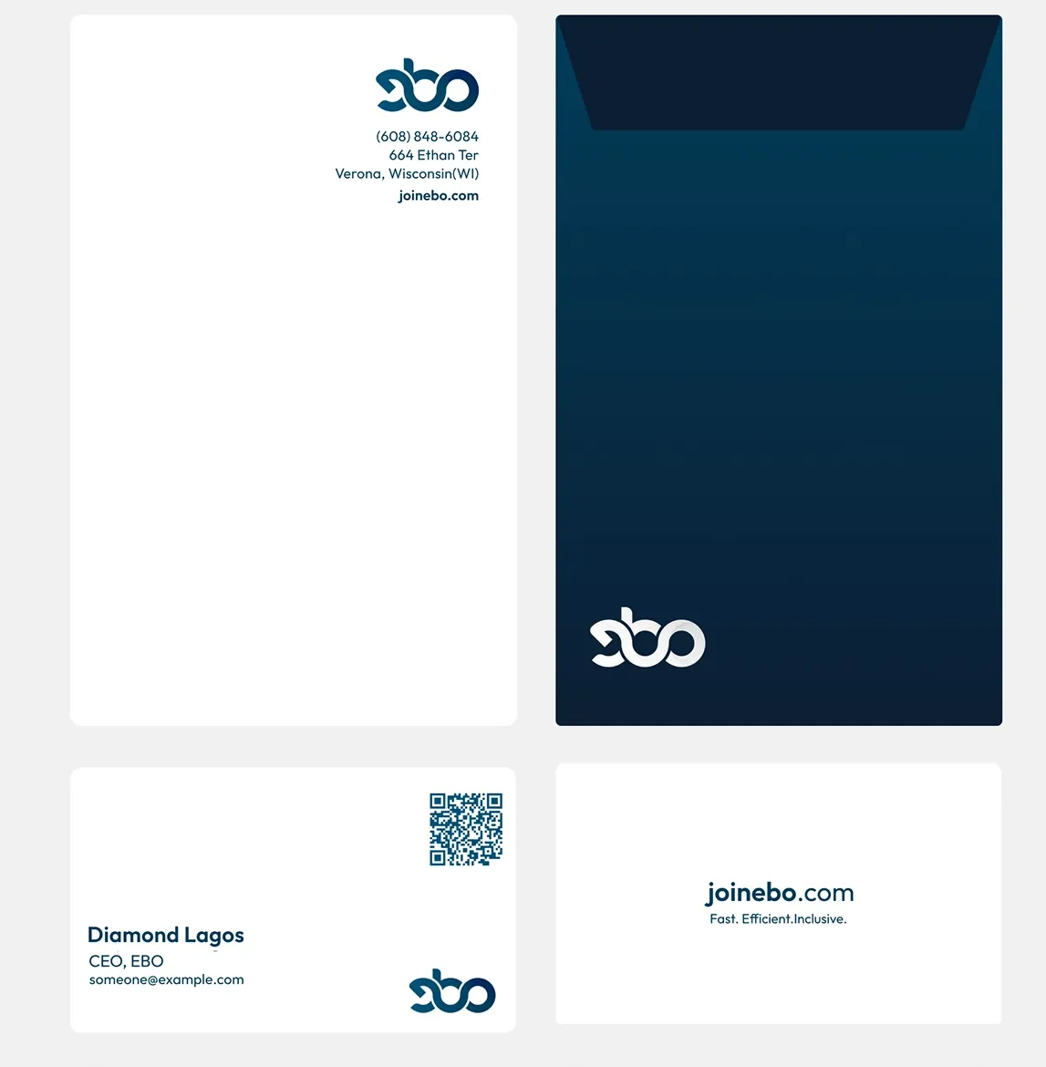
The rest of the board puts the system on things people hold. A letterhead, a navy envelope and business cards with a QR code carry the EBO mark. Mugs, pens, t-shirts and hoodies carry it too, with the QR code front and centre, because the point of every object is to send someone to the site.
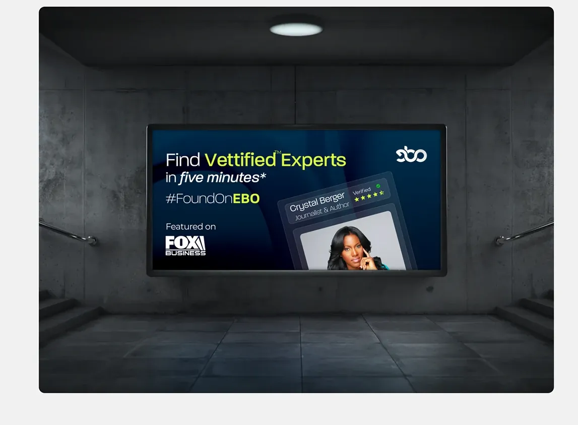
Sample advertisements show the voice: “Find Vettified experts in five minutes” and the hashtag #FoundOnEBO, set against a wall-mounted screen in a concrete hall.
Work with us
Have a project in mind?
Tell us about the work. We read every message and reply directly.
Start a project